Monday, October 31, 2011

Doyle Family Logo

I haven't posted in forever, hello world!
While I've been gone (from the online world), I've had two different full-time graphics jobs.. my current job being brand new! As well as doing some courses online for starting my own business, so I've had a busy time of it :)
I have been working on a few freelance things, but it's all going along very slowly.
What I'm working on now is a logo for my family reunion. My family is HUGE, each year we have a reunion with about 200 people.. this has been going on for 50 years!
This year, being our 50th anniversary, we're having a celebration with some souvenirs (mugs and other little items). So of course we needed a logo for it and I volunteered to do it.
The family weren't sure what kind of thing they were looking for yet, so I had to put together a few ideas before I started on the final. These are some of the "pre-designs" I came up with.
The family decided on using the crest, along with the family name, and a year (specifically for the 50th - this would be taken out later).

I had to contact some relatives in Ireland to find out what our ACTUAL family crest is, since there are a ton of different ones floating around on the internet. He got back to me with the proper one being this:
Of course, being straight off the internet, once this file was on my computer it was a tiny size and also extremely low resolution, entirely pixelated. So I had to recreate it!
I did this entirely in Illustrator - with a whole lot of layers I might add. Here is the final product:
Took me quite a long time, but it was worth it in my opinion! I might even get to do another project for the family, such as a cookbook.. but I will keep you posted.

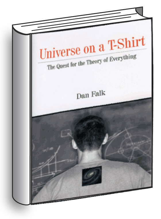
On another note, my graphics have been published in a book (collaboration with my sister Jessica Peter and I)! It's an travel, info graphic book put out by Lonely Planet called "How to Land a Jumbo Jet", and it comes out tomorrow! 

Check it out if you can :).. I'm on page 80!

-Heather


Friday, April 15, 2011

Sister Haystack Vintage

My newest post is about SISTER HAYSTACK VINTAGE!
Sister Haystack is an online vintage clothing store that I am starting up with my sister Jessica. We both love everything to do with vintage and we're constantly at flea markets, antique stores and consignment shops so we thought, why not!
Want to know why we are called Sister Haystack? It was the name of our planned folk punk band that never got off the ground because, well, we couldn't play any of the right instruments. We had to use the name somewhere, and it seemed just right to sum up our vintage aesthetic. That's why!
I thought I'd share all that info with you as well as show you the graphics I've designed for it. I had to create a whole new brand (FUN) so I went with the "Sister" idea and used some country-esque style.


This is our main logo I created (Not including the barn wood background but that has become part of our brand as well. ) I used the mud flap girl idea (two of them for sisters) and added some cowboy hats for the country style.  

We each got personalized business cards, kinda neat I think.


Our banner for our etsy shop. Again with the barnwood


Our twitter background, which is also in the style of the business cards. 


And that's all I've created so far. I will probably have more graphics coming as our business expands!

SISTER HAYSTACK IS OPENING ON APRIL 20TH. GREAT GIVEAWAYS! BE SURE TO CHECK IT OUT!
You can find us at http://www.etsy.com/shop/sisterhaystack
                              http://twitter.com/sisterhaystack
                              http://www.facebook.com/pages/Sister-Haystack-Vintage/184865991560084 

- Heather

Thursday, March 31, 2011

IAAG

Onto my newest project! IAAG!
IAAG stands for Interactive Alternative Art Gallery. If you check out the link I've posted you'll see what it's all about but I'll describe it in a few words. Basically this is started by a collective of alternative artists (alternative art being: graphic design, graffiti, music, tattoo art etc.). Each month we will have a different show with a different theme, put on at a venue. It will be a ticketed event with donations and lot's of fun! The basic idea is to get alternative artists some exposure, as there is not much of that going on for them. Alternative art wouldn't be found in a regular art gallery, so IAAG will help provide that exposure and really help out artists in the community! I've been working with Enigma Agency on this project. (Lexi's idea!)
I've been designing some things for IAAG, such as the logo, so I'll show that to you!
Lexi wanted something a bit futuristic and modern, and this is what we came up with together.
I really like how it turned out, any comments? :) 
Also if you haven't checked out IAAG yet.. you probably should! It's going to be the next big art event in Hamilton, ON!
-Heather 

Wednesday, March 9, 2011

Corset Top Recon

I haven't posted in a while, been workin' on graphics at ACTUAL work now. Haven't got the gumption to do more in my spare time.
BUT I have been creating clothes.
The past weekend I went to a Pimp N Ho costume party. Embarrassing, I know. Haha. I knew the perfect shirt I could use for it though. I had been working on the shirt for a long while and never got around to finishing it until now!
WOO
So check out what I've created. Here's the before pictures.

This is the horrible 80s dress it started out as, with my sister as the model. She actually got some use for this dress as well. (She went to a party that was themed 80s prom!)

This is the top of the shirt after I had cut the bottom skirt part off. A little easier to see. 

And here's the final product. The front of the corset.

The back of the corset. Created with elastics and buttons for extra hold and comfiness!

And finally the shirt on me! 

It fit real nice and I was able to wear this shirt (along with some more ho-ish items lol) to the party.
What do you think??
-Heather 


Friday, February 25, 2011

Logo & Branding

So whenever I get bored I've been working on those pretend businesses my sister, Jessica,  gave me. I was having an especially anxious day, wanting to get some things done but not sure at all what to do SO I worked on one of the logos to calm myself down.

The one I chose today was called Avocado Designs. Here's the logo I came up with for it.
I think it turned out really cool, I like the different styles between the lettering and the actual avocado picture. 

Anyways, after that I was still bored so I started working on a website for the avocado designs ( my fave) And this is the page I came up with.

Also may I just mention it's quite difficult to come up with a look for a business that doesn't exist! I'm not even sure what kind of design this place does :P Haha One day I'll get my sister to invent an entire business for me and I will create something off of that but for now I think I gave them quite a nice identity.

It'd also look a lot nicer with some photography in the spaces. Just picture it!

That's all for today everyone! Keep checkin ;)
-Heather 

Monday, February 21, 2011

3D Books

Hi everyone!

I haven't posted in a long time, and I promise I've been workin' on new stuff.. :P I've just been really busy. Haven't had time to show everyone my new stuff.

Lately, I've been doing some work for Chris Luckhardt of Motionblur Studios. Chris is a Drupal website designer and is getting me to design some graphic art for the websites he creates.
We've worked on two projects together so far and I'm going to share one of them with you!

The one project Chris asked me to do was a vector version of a book icon cover. This was for a website for Dan Falk (journalist and published writer).
Chris wanted the books to look quite real. This is what I created for him at first.

Chris and I talked over this illustration and decided that the perspective was a bit off for what Chris was hoping to achieve. I changed around the perspective a little and added the covers, a bit of a drop shadow and shading and here's what I came up with.
Here's the first book I created in white.

And the second in black.

This was actually a pretty fun project. I'm sure Chris and I will be working together on some more projects in the future, which I will definitely post here! Check for new updates :)

-Heather 

Wednesday, February 2, 2011

Dudley Smith Metalworks Logo

Hi everyone!

This post is another one of the "pretend" businesses that my sister Jessica invented for me. I wanted to work on one of the new logos, but as I don't have my tablet pen or cord (STOLEN! :O) I had to do one of the logos that would be straight.. and my tablet pen would not be needed. 

The business I chose today was Dudley Smith metalworks. I forgot to mention before I have sketches drawn up for pretty much all the logos so I already know the basics of how they will look. This one I wanted the words to look like they were made of metal. I tried adding some metal shine but it looked pretty cheesy and I like how it turned out.

My first logo.

I added the blue edges to make it a bit more manly,
 but I'm not sure if I like this one as much as the first.

What's your favourite? With blue or without? I'd love your opinion on it! 
-Heather


Tuesday, February 1, 2011

Blog Header- Jess Gets Creative

This is my newest project, a blog header done for Jessica Peter's blog Jess Gets Creative.
She didn't give me many specifications for this project other than she liked the curly pirate type font as well as the quill pen.
I know she likes vintage maps, so I added that as a background overlay/gradient. She has a published article about Van Gogh, and he is one of her heros so I thought that would be appropriate for her header.
She is also looking to publish a YA fiction novel about the Wild Hunt so I also added that to the header. 


She really liked how it turned out, and probably will soon be putting it up on her blog. What do you think?
-Heather

Monday, January 31, 2011

Creative Allies

I was recently referred to the website Creative Allies by my boyfriend Dan Auld and thought it was a really cool idea. Basically the whole idea around it is people post design contests, such as a logo, a poster and whatnot and get designers to compete for the winning design.
If you win you get prize money and sometimes a prize pack, depending on the contest, if you don't.. oh well at least you have some new experience and a new portfolio piece!
The contest I decided on was a static webpage design for Quannum Projects. I haven't posted it online yet, still have a full month, but I decided to show it off on here and see what others think of it.
That way I can still make changes and whatnot. For the project they asked for a static homepage as well as one template for the inner pages, they mentioned keeping the wordpress themes in mind.

This is the homepage of the website.

This is the inner page template of the website.

I'm not sure if I kept the wordpress theme in mind enough but I still really like how it's turned out so far. What do you think?
-Heather

Friday, January 28, 2011

The Newest Business Card

Lately, I've found myself in the position where I'll be talking to someone about my freelance projects and it would be the perfect opportunity to give them my business card, but unfortunately I haven't got any printed lately.
I've made several different business cards for myself but for some reason can never decide on what I actually want. I find it's a lot easier to create things for other people than for myself. 
Anyways, I came up with a brand new business card to get printed and I think this is the one! At least for now. :P

Front of the business card

Back of the business card

What do you think? Any changes I should make or should I go ahead and get it printed! Let me know, I'd love to hear what other people think. 
-Heather :)


Tuesday, January 25, 2011

Logo Projects

I recently decided I'm going to make a few new different logos for my portfolio and also for practice. My sister, Jessica, a creative writer gave me help with coming up with some pretend businesses.
The first one she came up with was Carol's Flowers. I drew up a few logo sketches and then after creating it using Photoshop and Illustrator, this is the logo I decided on.
My first all-black design

I changed it up a little with a lower opacity, I like this version better than the all-black.

And finally here's what it looks like in colour, though all the colours could be easily changed, keeping the same shades.

I figure this new logo project will also give me something to use as examples if I ever decide to start selling graphics on Etsy. 
Keep watching for new logos! I have a lot of sketches (and pretend businesses) to create logos from.
-Heather

Sunday, January 23, 2011

Presents for the Boyfriend


Today is my One year anniversary with my boyfriend!

I decided he deserved a really good present, for being such a good boyfriend :P, so I made him some crafty items.
Dan is starting his own T-shirt company. He's recently bought himself a screen printing machine and has started drawing designs and printing some shirts. The present I made him was to help him really get into the business, and also for some inspiration!
This idea was somewhat like the Recipe Binder but instead of Recipe template pages each page would have a blank t-shirt for him to draw his ideas onto.
He would circle the "Front" or "Back" depending which it was, draw his design in, and write in what colours the t-shirt is as well as the print. Good idea? 


I padded a binder from the dollar store and went to Fabricland to get man-ly type fabric. I found this stretch corduroy that looks like a mix between animal print and woodgrain. Pretty cool in my opinion and it feels VERY nice!
Outer Binder

I went out to Michael's craft store to get some felt for the innards. I found this dark brown snakeskin type felt that looked pretty manly-esque. This covered up all the rough edges from the fabric.
The binder all put together.

As well as the binder, I got him two shirts to print on, and a few arty items from Mixed Media on James St. N in Hamilton, ON. He loves that store and I figured it would help make the ultimate present for him!
I picked out a Hemp sketchbook (so he could draw up his pre-sketches for designs) a Juxtapoz art magazine for inspiration and finally a neat little notebook that says "Business" on it. (Dan has a print he's drawn with a cowboy-styled gun, I thought this would be appropriate.)


And that's it for today everyone! Keep checking for new updates, as I'm working on new projects all the time.
Comments are always welcome.
-Heather

Wednesday, January 19, 2011

Ruining the Surprise

Okay I guess this is sort of ruining the surprise.. or maybe I've built up enough anticipation that it's perfect! I'm not sure but right now I'm sharing my newest business logo with you.
It's the lingerie business I'm starting..
I went through quite a few different logos before I found the one that was right for this project so I'll show you  my process as well.
Here's what I started with in my sketchbook.

I got my inspiration from the Yogen Fruz advertisements. They have a cool little banner for their featured Frozen Yogurt. 

Here's the writing I came up with for the banner. I curved it with the banners curves so it would all fit without being too small.

This is how it turned out once it was all together.
I didn't really end up liking this at all. Though I was going to add some filigree to it.. it just didn't seem like it was very professional.

So I decided to change it up completely. This is my logo that I'm working with now and I like how it turned out a lot. 
The bow will be different, vectorized, as I just used a photograph of someone else's for the meantime to see how it would look.

Here's the banner for my Etsy shop to go with the logo.


So what do you think of everything? I'd love to hear comments!

-Heather


Saturday, January 15, 2011

Recipe Binder and New Project!

So I've been failing a little on getting my friend's Christmas present done and to her.. but I've finally finished it tonight and decided to show it off!
( I told her not to look at my blog :P )
I was working on a recipe binder for her. I know she really likes girly stuff and cupcakes so I made her the cutest binder I possibly could.
The recipe binder front. A light pink sparkly fabric, I got this at a thrift store for 3 dollars and I still have some left! Awesome!

The binder all put together, pink sparkly felt for the inside.

And finally a close up of it (just couldn't resist taking a picture of the sparkles)

In addition to that, I'm starting my newest project and THIS is what it involves!

That's right! A wedding dress! I won't tell anymore for now but let's just say I'm going to be making it into something else. Exciting.
Comments always welcome.
-Heather

Tuesday, January 11, 2011

A Brand New Logo!

Hey again everyone!

So, recently I had been thinking about starting my own business. As I went to school for graphic design, I was thinking I should do some freelance stuff and start my own shop online on Etsy.
I knew I'd need a shop name and logo and everything so I started brainstorming with everyone who would help me out and eventually my mom helped me come up with the name Happenstance! ( My initials are H. A. P.) The name just seemed to fit perfectly. 

I decided I would use a Dandelion as part of my logo as well, the original idea was to make some of the dandelion poofs blowing away across the logo but I didn't quite get to that part. 


While I was going through this whole process, I came up with an amazing business plan for something completely different but I'm so excited about it! Unfortunately I won't be using this logo and a completely different logo is in the works.

Curious what my business is going to be?! We'll you're just going to have to wait as I'm keeping it sort of under wraps. I'll give you a hint though, lingerie! :)
Keep checkin' out the blog to see some super sweet stuff.

-Heather

Monday, January 10, 2011

Recipe Template Page 2

Hi again!

As I mentioned before, for Christmas, my boyfriend Dan and I made a recipe binder for his mom! I unfortunately didn't get a picture of it yet but I do have the recipe template page that I created for it so I thought I would show that to you for now.
The idea was for Dan to draw up some artwork for the templates and then me to put that in and create the page layout.

This is what we came up with.
Dan drew up the flower in black ink and then we scanned it in and played with the whole thing in Photoshop. A while ago I had made the watercolour background for fun so I place that in, added some shading and highlights and it was ready to go. We went for a brown and blue theme, and the binder had some lace inside it so I also added that to the template. 

And that's all I've got for today! You can check out more of Dan Auld's work HERE.
Comments welcome!

-Heather

Sunday, January 9, 2011

New Crafts

Hi everyone!
Been a while since I posted, I've been so busy with Christmas, working and starting up my new business that I haven't had time to go on the internet much!
But, the good thing about not posting in a while is that I've got a lot of new crafts to show you :)
For Christmas, I made some crafty presents for a lot of people.. as well as a birthday present for my mom.. here they are!

First off I made some recipe binders, one of them I gave to my boyfriend's mom (unfortunately before I took a picture of it! but I will hopefully be able to get a pic in the near future) and one of them I gave to my friend Chelsea. Here it is

The front of the binder. I bought a binder, padded it with cotton batting then covered it in a purple animal print fabric. The inside covers I used a purple felt to cover up the rough edges and empty areas.

This is the inside of the binder. I made the recipe template as well using Photoshop 
Hopefully she gets good use out of her recipe binder!

Another present I made was one for my mom. She had mentioned she wanted some padded hangers for Christmas... turns out padded hangers are extremely hard to find :S, so I made some for her! 
This is the complete set. I took plain wire hangers.. bent the bottom part up to the top part (with the help of my boyfriend), wrapped them in cotton batting, covered them in fabric and sewed them up.

A close up of one of the hangers.

Action shot of the hangers!
As much as I like how the hangers turned out.. and as much as my mom liked them, I probably will not be making these again! They were really tough.

Mom's birthday comes soon after Christmas so I needed to think of another present to get for her. I had this chair sitting in my room for a long time waiting to be recovered and I thought this would be the perfect opportunity!
Before of the chair. Rusted Green-tone paint with grubby fake orange fur.


Redone chair. I chose the same fabric as I used for the hangers, as she's probably going to use the chair inside her walk-in closet. I repainted the chair a creamy white colour and the circular ends I dry-brushed them with a golden colour. 

I really love how this chair turned out, as did she which makes me happy :)
Let me know if you have any comments about any of my projects! I love comments
More projects coming soon.
-Heather